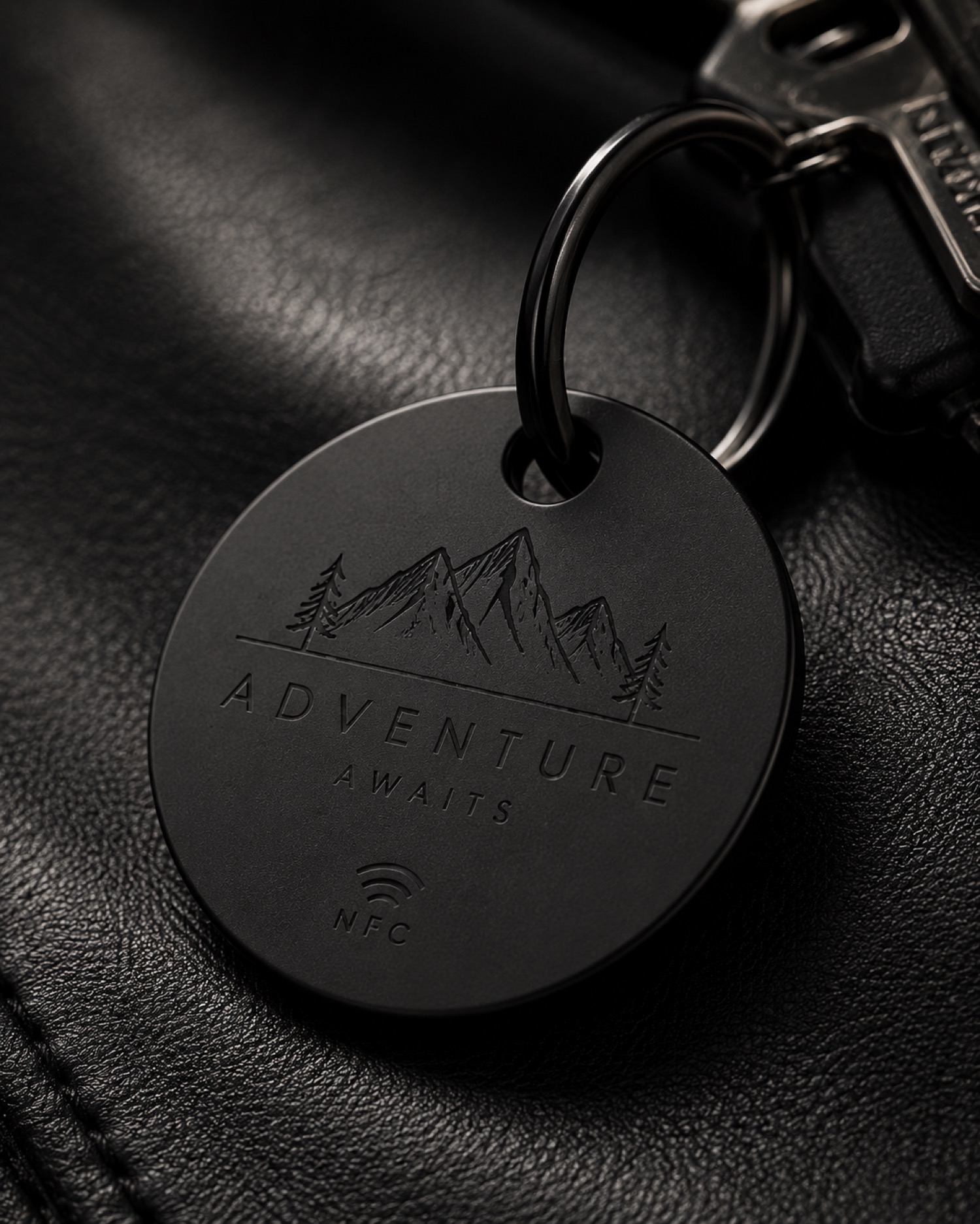
Begin with the message in one color and the background in another. This simple contrast check makes it easier to see whether a short name will read clearly before borders, icons, or extra lines compete for attention.
Save the plain version first
Keep a copy of the layout that contains only the message and its placement. Review it at the likely viewing distance, then add one decorative element at a time. If the main text becomes harder to read, return to the plain version rather than forcing more detail into the available space.
For other compact-project planning notes, browse /updates/ before preparing a sample.