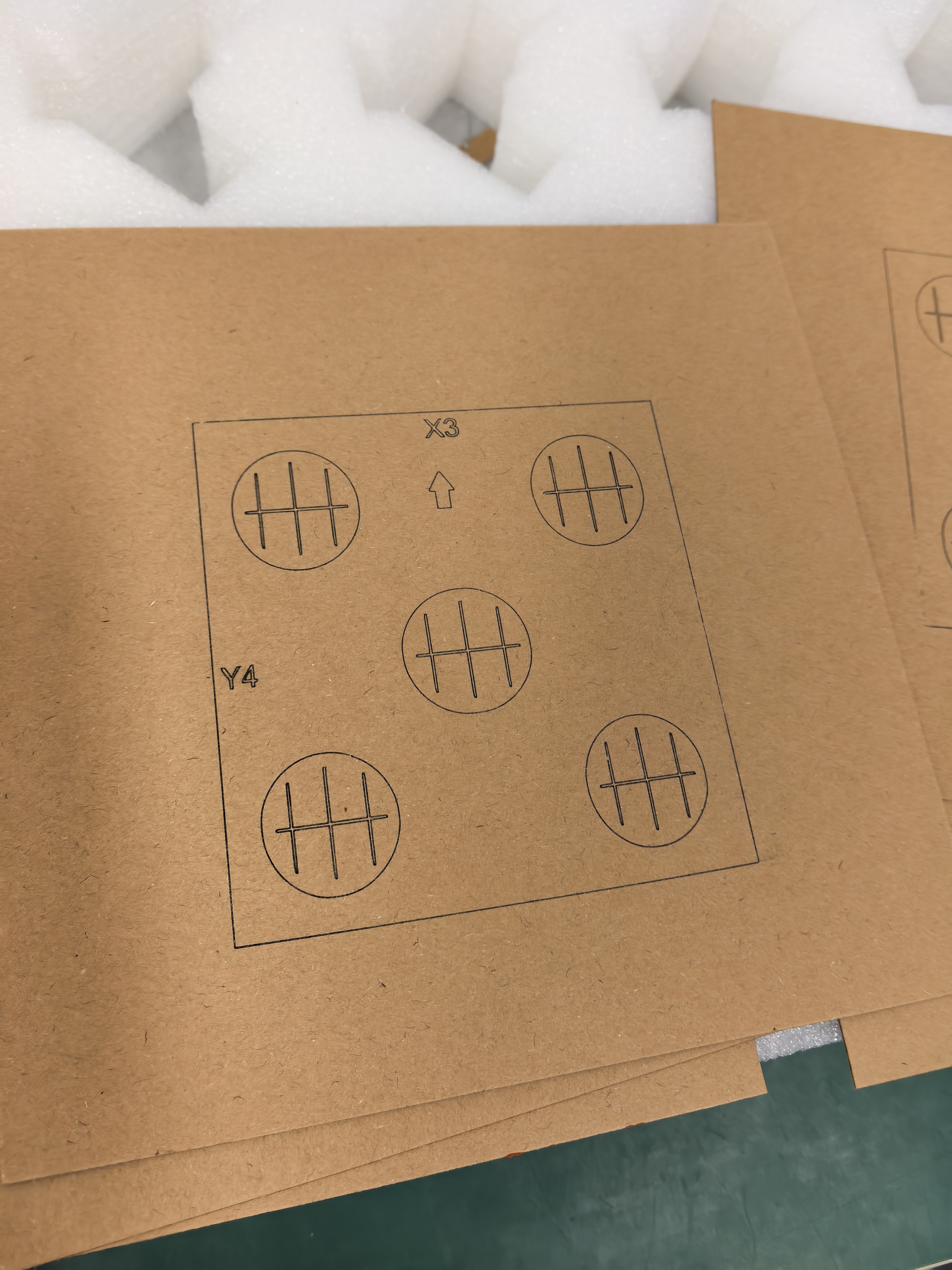
A dedication that reads clearly in a message can become awkward when it is split across several short lines. Before preparing an AntBelt G1 project, review the exact line breaks at the intended artwork size on paper.
Read the inscription as a whole
Print the layout without automatic page scaling. Read it once for meaning and once for grouping: keep a person's name together where possible, and avoid leaving a single short word stranded on its own line. If the wording does not fit, prepare a shorter alternative for approval rather than quietly changing the text.
Preserve the approved arrangement
Record the wording, line order and artwork revision together. A customer who approved the spelling has not necessarily approved a later change from two lines to three. Keep the approved proof available beside the exported file so the layout can be compared without relying on memory.
This paper review addresses composition only. It does not establish that small lettering will engrave legibly on a particular surface. Resolve material suitability and use a separately documented sample assessment before committing an object. If the layout must change after that assessment, request approval of the revised proof.
Browse related planning notes in /updates/.