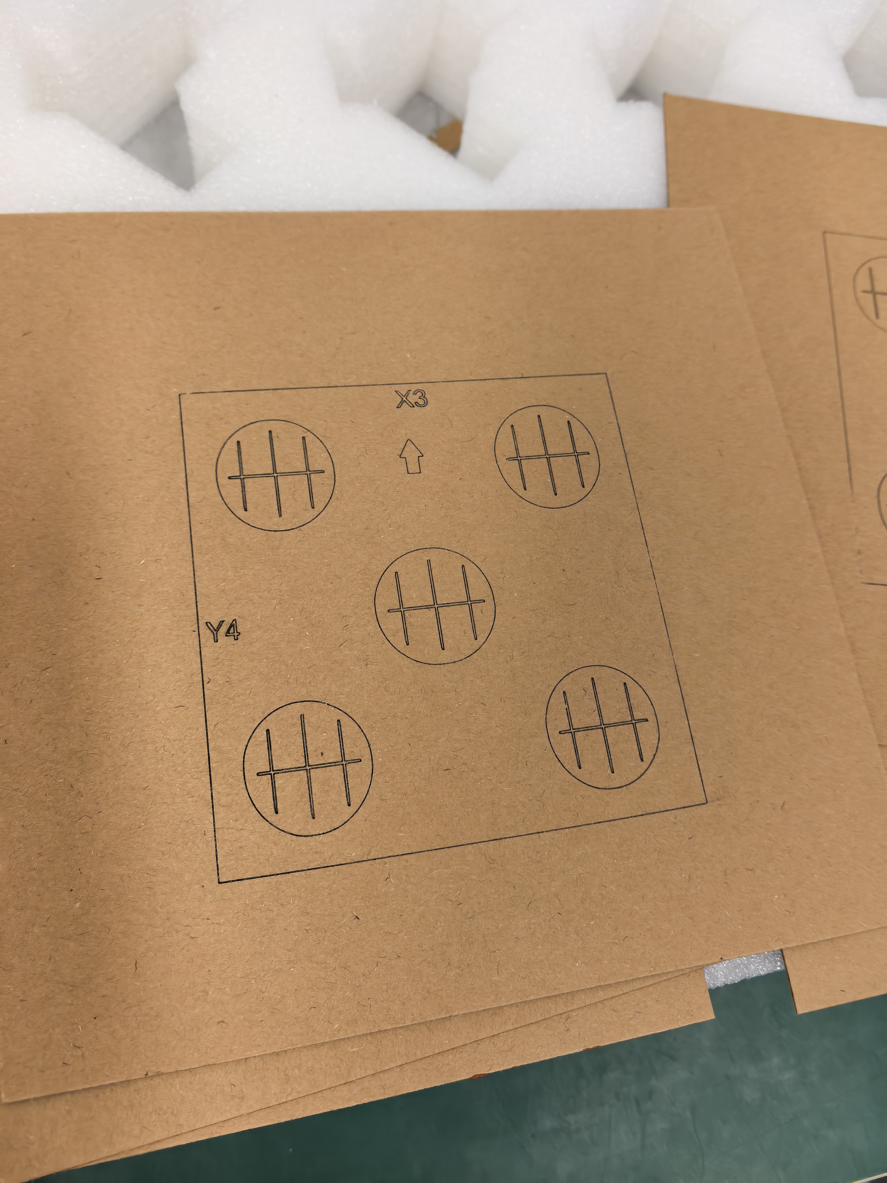
A monogram can look balanced on a large screen while the spaces between its letters become difficult to read at the intended presentation size. Review those spaces deliberately before preparing a personalized design for AntBelt G1.
Read the gaps as part of the design
Make a paper proof at the intended artwork size. Look at the opening inside each letter and the gaps where initials overlap. Ask a second person to read the initials without first telling them the answer. If they hesitate, try a simpler arrangement instead of assuming the engraving process will clarify it.
Compare only one change at a time: letter spacing, overlap, or typeface. Keep each proof labeled so the chosen version can be identified later. A decorative overlap may be attractive while also making the letter order ambiguous.
Separate composition from a processing result
A paper proof establishes a layout preference. It does not predict the appearance of an engraved surface or establish a minimum feature size. Any later sample needs an identified, appropriate material and the applicable operating guidance.
Keep the selected proof beside the approved artwork record. Record which initials a viewer should read first, particularly when the design serves a family name or a two-person gift.
Browse related AntBelt project notes in /updates/.
Review current AntBelt G1 project details on Kickstarter: