A design can look generous when it fills a laptop screen and cramped when it sits beside the object it is meant for. Put a familiar scale reference next to the first printed proof so a reviewer can judge the composition before any sample is prepared.
Review at a useful viewing distance
Print the artwork at the intended visual scale, label its revision and place it next to the actual blank or a clearly identified mockup. Step back to the distance at which someone would normally hold or see the object. Ask whether the main word is readable and whether decorative detail competes with it.
Record the answer as an artwork decision. If the blank changes, repeat the proof instead of assuming the earlier choice still applies.
Keep the proof in its lane
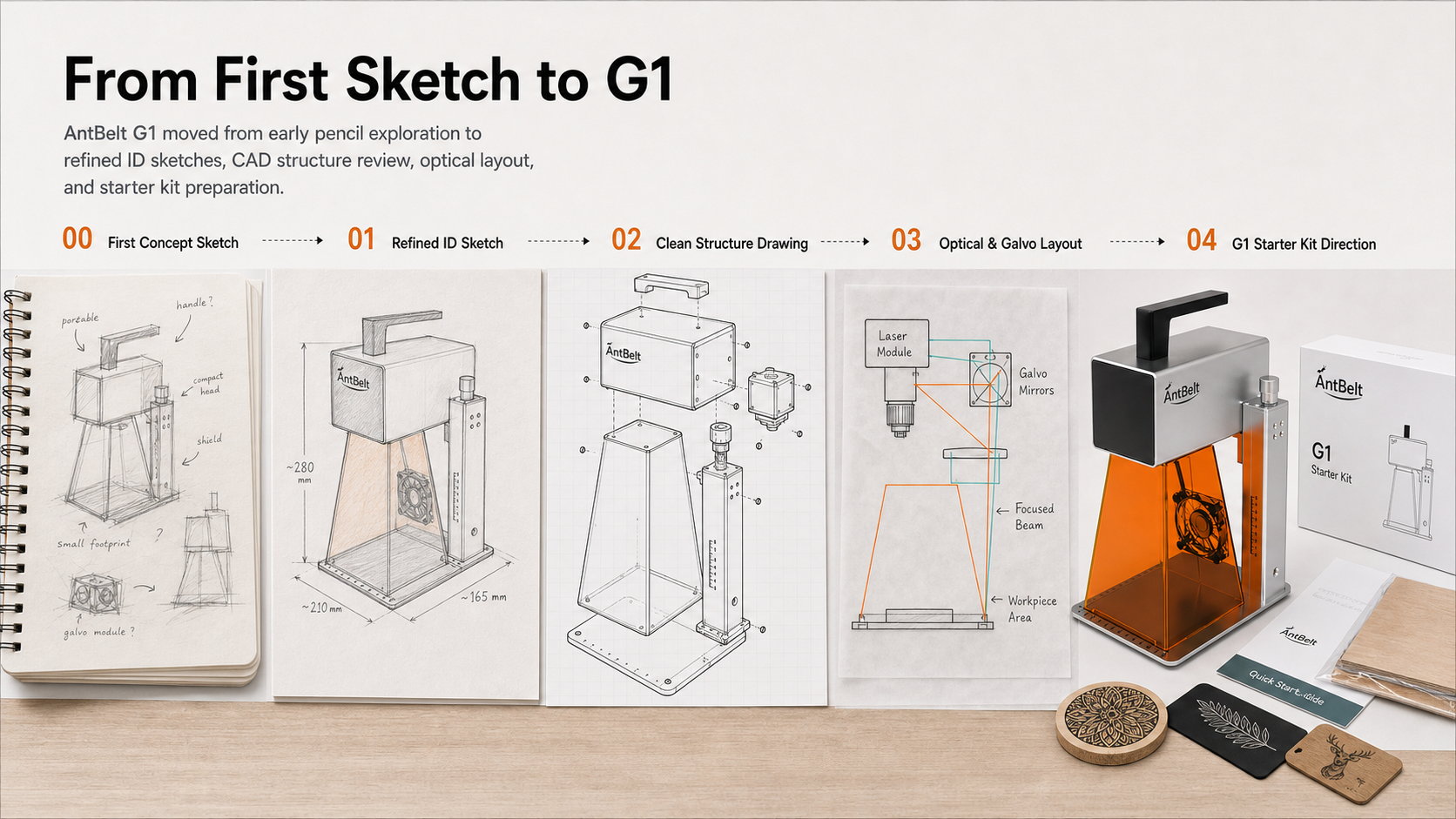
A paper proof does not predict contrast, material response or the final appearance of an engraving. For an AntBelt G1 project, keep it beside the source artwork and any later documented sample. The hero illustrates design planning rather than a verified result.
Browse more workflow notes at /updates/.