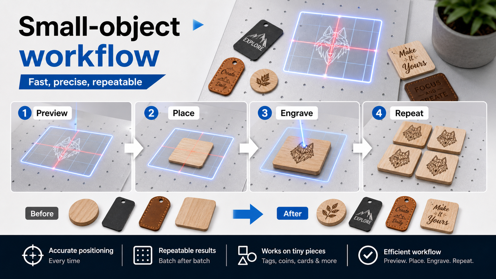
Small blanks make artwork mistakes visible quickly. A design that looks clean on screen can become crowded once it is placed on a tag, card, coaster, or patch. A two-step review helps makers slow down before they commit to a sample.
The first step is a content review. Remove extra words, check the logo or illustration shape, and make sure the design still makes sense at the intended scale. The second step is a placement review. Look at the edge distance, orientation, and how the design sits inside the visible blank.
AntBelt G1 content should stay grounded in that kind of workflow habit. The point is not to promise that every small object will behave the same way. The point is to help makers ask better questions before a result becomes a product decision.
When in doubt, save a plain version of the artwork and a more detailed version. Test them separately, then compare the result notes instead of guessing from memory.
For more daily AntBelt notes, see /updates/.
Shop AntBelt G1 on the official store to review current reward details and campaign updates: