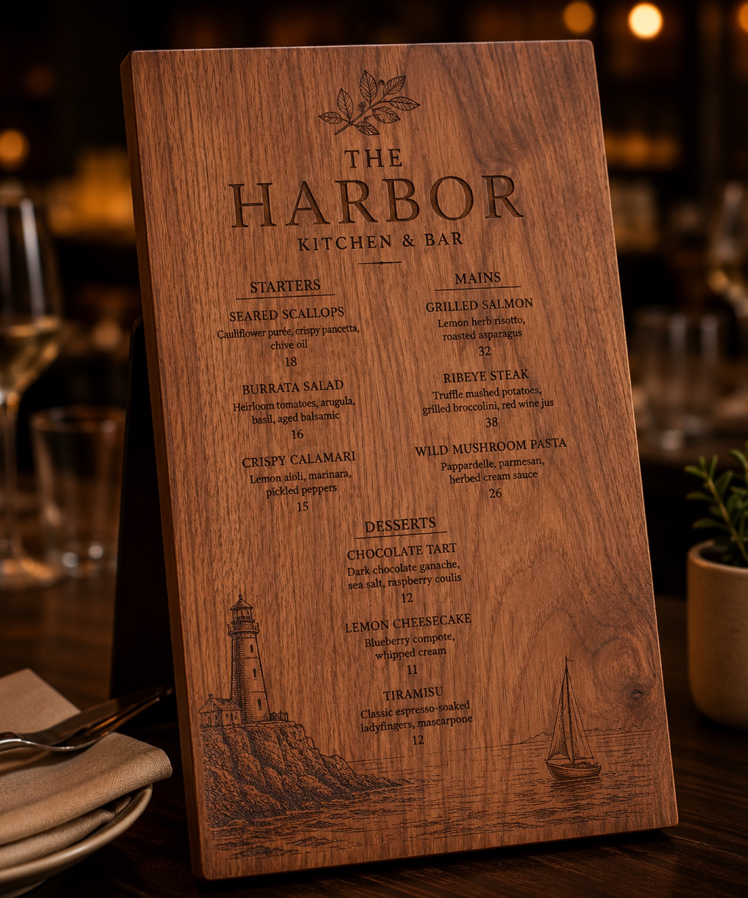
A small shop does not need a huge personalization menu on day one. A tighter sample menu with three clear options is easier to photograph, explain, price, and revise before customers start asking for edge cases.
AntBelt G1 content is strongest when it helps sellers think through proof before variety. A seller might test one tag, one card, and one keepsake blank first. Each option should have a separate sample photo, order note, and plain-language boundary about what has actually been reviewed.
This approach also helps avoid overpromising. The seller can describe a tested layout, a visible sample, and the next question to confirm, instead of implying that every object, finish, or rush timeline is already solved.
The three-option menu is not a final catalog. It is a launch-period learning tool: simple enough to maintain, but varied enough to show what kind of product direction is worth testing next.
For more AntBelt G1 update pages, see /updates/.
Shop AntBelt G1 on the official store to review current reward details and campaign updates: