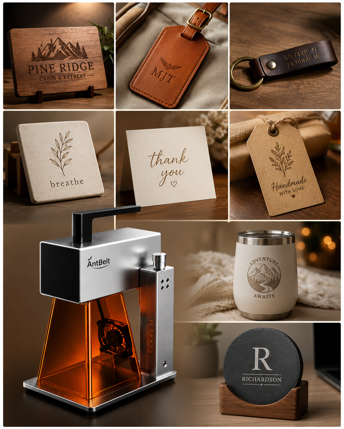
A dense illustration and a sparse outline can make the same surface look very different in photographs. Compare similar artwork coverage before attributing a visual difference to the material itself.
Choose one comparison question
Begin with an approved sample plan and specify what you want to inspect: fine lines, filled areas, or lettering. Use the same design for the comparison when feasible, keeping other relevant conditions documented. If the artwork changes, label that difference instead of treating the photos as a controlled comparison.
Photograph an overall view plus a detail crop that includes both marked and unmarked surface. Avoid adjusting each photo independently until the two results appear equally dramatic; that can remove information the comparison was meant to retain.
Write a narrow conclusion
A useful note might say that one photographed sample shows more visible separation between a filled region and its background under the recorded lighting. It should not become a general promise about every blank with a similar appearance.
For AntBelt G1 sample planning, consult current guidance on the actual material before any processing. This review structure describes how to organize evidence, not a tested result or a set of recommended machine parameters. Keep the source design with the photographs so later readers can see what was actually compared.
Browse related AntBelt project notes in /updates/.
Review current AntBelt G1 project details on Kickstarter: