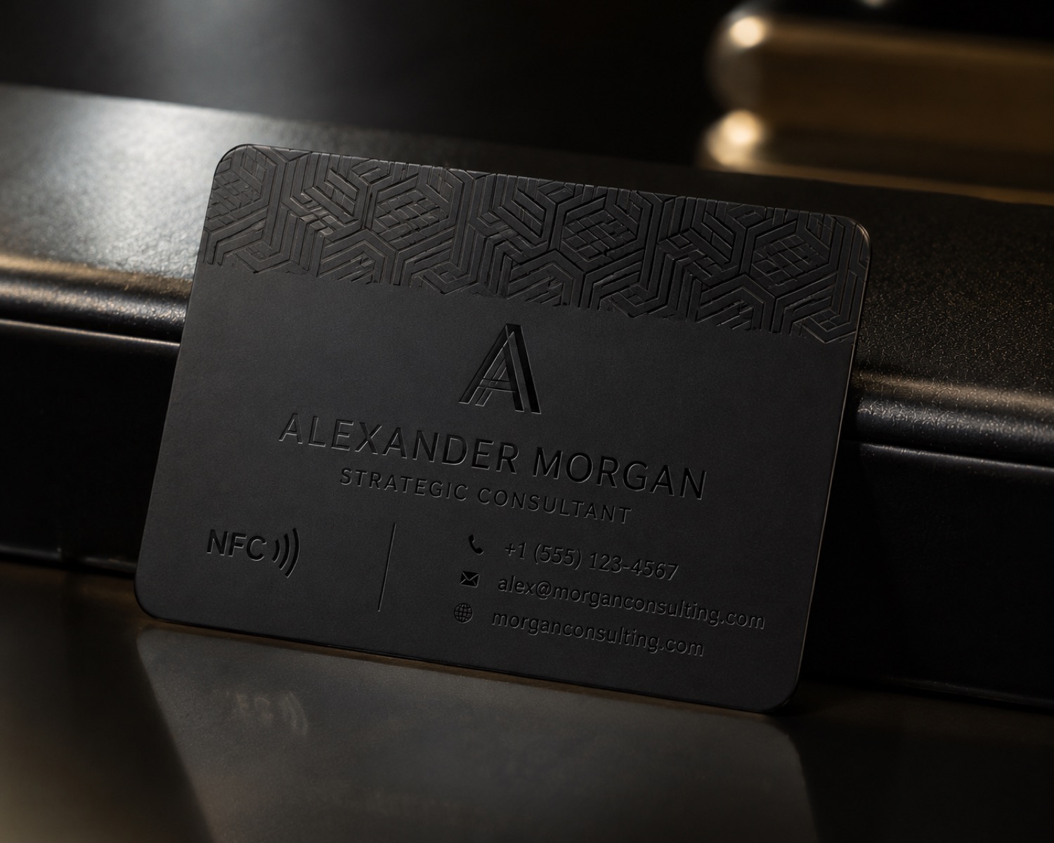
The smallest visible detail in a close photograph is not always the most useful result. A legibility test starts with the distance and lighting in which a person will actually read the object.
Choose the reading condition
Write down whether the item is meant to be read in the hand, on a shelf, or across a counter. Use ordinary lighting for the intended setting before adding a close inspection light. This prevents a macro image from becoming the only standard of success.
Build a bounded artwork ladder
Prepare a few text sizes or line weights in one test file while keeping the wording simple. Change one design variable at a time. The test should reveal where recognition becomes uncertain, not promise a universal minimum feature size.
Judge the complete mark
Check letter openings, spacing, punctuation, and the difference between similar characters. Ask a second person to read the sample without seeing the source file. Record disagreements instead of choosing the most favorable reading.
Preserve the surface description
Photograph the sample and note the known material or finish, artwork version, viewing condition, and date. Material and process choices may affect the outcome, so repeat the check when the surface or design changes.
This approach favors usable information over impressive enlargement. Browse /updates/ for more AntBelt G1 sample planning and consult current official guidance for real operating decisions.
Review current AntBelt G1 project details and updates on Kickstarter: